top of page

2018-2019 PORTFOLIO //
 the realest one of them all |  1. Basic Shape HeroHere, Thanos is flicking away Ant-Man as The Wasp and Antony are swooping in to try to save him. We had to use basic shapes, and I feel like this is way better than my Basic Shape Animal from 1-2. |  Board GraphicsWe decided to use the deconstructed art style because we thought that it could be used ironically to make the happy, innocent Disney characters into their sullen opposites. We also included their symbols, of sorts, in the background as to add a little more detail than just having a character on a carbon fiber backdrop |
|---|---|---|
 Munny PostcardThis postcard describes the Munny figure that we made from the Bauhaus era. The hardest part of this project was working on the curved surface of the Munny because I have never really done physical toy design before. |  Business CardMy business card went through many iterations, but I finally decided on this one. I had come across hardships while printing since my original text colors were too similar to the background, but I think this ending product is the best version. |  PQ BannerThis banner was created for a contest by the Rancho Peñasquitos Town Council. Although the I didn't win, I think the design captures the sunset design I was aiming for. |
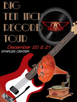
 8. Group #17_Final Gig PosterThis gig poster is for the band Aerosmith, named after one of their biggest songs. We decided to incorporate a record due to the title along with a famous red Aerosmith guitar. |  3.-Dillon_Jason_Solo-Graphic-Design-T-1.I don't think this is one of my best works, but I really enjoyed making it. looking back, the three stripes are a little similar to Adidas, but I like how the icons flow through the lines. |  Dillon_Jason_Final1This is my final design 1 for the Sundance 2018 Summer shirt. I really enjoyed making these and finding fun ways to incorporate summer themes. |
 Dillon_Jason_Final2This was the second design, and is just a variant of the first. I like this design better because the placement of the Wildcat is better and more out of the way. |  Dillon_Jason_Final4This is a second design that I made, making a play on words with Sundance's name. I really like this one and the placement of the words also work very nicely. |  Dillon_Jason_Final3This is just the same image as before, but his eyes are smaller. I was asked to do it just as another variant so we could see the differences. |
eZine
The eZine project was very fun and exciting because it was the chance to make a publication. My favorite part was learning how to use InDesign.
bottom of page